Create Tailwind Wireframe Template for Kadence Theme
A few days ago I decided to try the Tailwind system on a Kadence theme. I find a lot of good things about this system. Tailwind allows you to keep the rhythm of the layout, while the Kadence theme has the flexibility and speed of page loading.
At the same time, Kadence recently announced a good opportunity to sell themes with cloud access. The main goal was to use as little customization and more customizer as possible.
This is not a typical integration and is not tailwind itself. The goal is to recreate a similar style, the main thing I like about tailwind is that all sizes are a multiple of 8, let’s see if Kadence can manage all the parameters so flexibly.
Choosing Wireframe in Figma
https://www.figma.com/community/file/1137429072536633879
I know a little bit about tailwind. There are many samples in the Figma community that you can use. I chose the simplest Minimal Wireframe Kit by Bonnie Hong and the Flex UI Library for Tailwind CSS by Shuffle both based on the Tailwind CSS Design System
The main goal of creating the Kadence Tailwind Wireframe Template was to help me figure out how to use the Tailwind rhythm styles with the Kadence theme with as little time, effort and affecting as little customization as possible. I wanted to keep the Kadence theme as clean as possible.
Setting up the customizer
Layout settings
I set the width of General -> Layout to 1248px *(Later I changed this value to 1216px)
Content Left/Right Edge Spacing:
| Desktop | Tablet | Mobile |
| 0 | 2 | 1 |
Content Top and Bottom Spacing:
| Desktop | Tablet | Mobile |
| 4 | 3 | 2 |
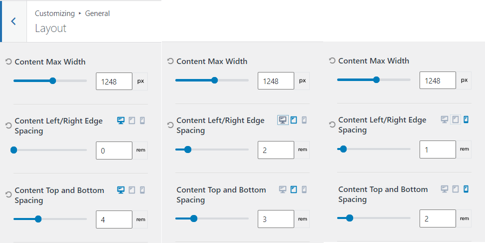
*(I later changed this value to 1216px)
Color setting
Left it as is.
Font setting
After a little analysis, I realized that it is enough to set the headings only for H1, H2, H3, H4
Base Font: Inter 16px
Heading 1
| Desktop | Tablet | Mobile | |
| Font-size | 60 | 48 | 32 |
| Line-hight | 1,4 | 1,4 | 1,5 |
Heading 2
| Desktop | Tablet | Mobile | |
| Font-size | 60 | 48 | 32 |
| Line-hight | 1,4 | 1,4 | 1,5 |
Heading 3
| Desktop | Tablet | Mobile | |
| Font-size | 24 | 24 | 24 |
| Line-hight | 1,5 | 1,5 | 1,5 |
Heading 4
| Desktop | Tablet | Mobile | |
| Font-size | 20 | 20 | 20 |
| Line-hight | 1,5 | 1,5 | 1,5 |
The problem
Kadence has default margin after headings that are specified in em, which makes it difficult to set the margin in multiples of 8 for a 60px font for example. 0.5 em for which 30px instead of the required 32px
.single-content h1,.single-content h2,.single-content h3,.single-content h4,.single-content h5,.single-content h6 {
    margin: 1.5em 0 .5em
}
I can’t say that em is not the right choice, but you would have to add a margin in the element’s layout. Although it could be solved by adding margin to the customizer.
Do you think it’s worth adding the ability for the user to set their own values to keep the code clean?
Button Settings
Border-radius: 6px
Font-size 14 and letter spacing 20 from Figma for all screen sizes. (Later I set my spacing value, see below)
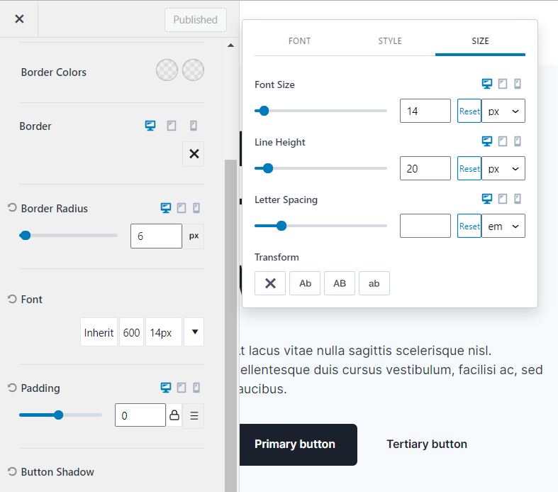
If you set padding in the customizer, it will only affect the M size, choose how you prefer
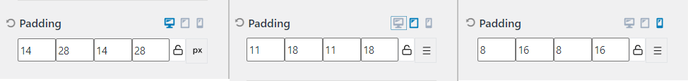
The values for the buttons I took from the Flex UI: Large, Medium, Small button, respectively. By setting the values in this way my button will change according to the mobile device.
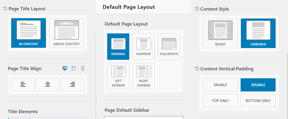
Page layout Settings
Not to be confused with Layout, this setting is in Posts/Pages Layout -> Page layout ->
Page Title Layout: in content
Default Page Layout: normal
Content Style: unboxed
Content Vertical Padding: disable
This is the end of the customizer setup.
Block setup
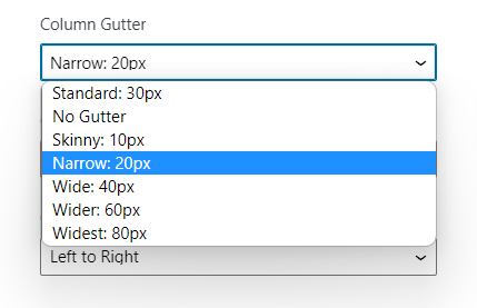
When working with blocks, we are interested in indents. They can be conventionally divided into two parts, the first is margin/padding, which we can very conveniently set to 4 rem to achieve 64px, but the indent between columns, and as a consequence between rows on tablet and mobile we can only preset to choose
I set it to No gutter 0px/ This is the first place where we can’t set it to a multiple of eight.
We can see that in the work with blocks we can not maintain and inherit gaps of multiples of 8, so you can use the section with a gap of 32 px. We will talk about them further on.
The difference between using a row and a section is mainly that it is easier to assign a full width background image or color to a row and not to a section.
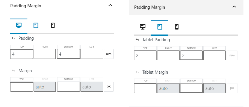
Padding/Margin
Despite the fact that the template uses 80px indent, I used a 64px indent, or rather 4rem? which is because the body-font is set to 16px (16*4=64)
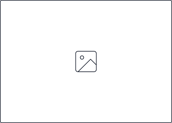
Image
I uploaded one image 590 by 425 pixels it is used through the whole template at Bonnie Hong, and in Flex UI too, there is no image that keeps the proportions in multiples of 8. Perhaps this is not necessary. Even the choice of image is a big separate topic.
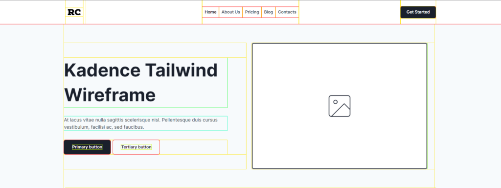
Wireframe in Kadence
Now that all the basic settings are applied, we just drag the blocks and get the expected result.
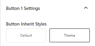
By default, the button does not inherit the theme styles. A switch will solve the situation, but it’s still not clear what those default styles are. Do you know?
Let’s compare
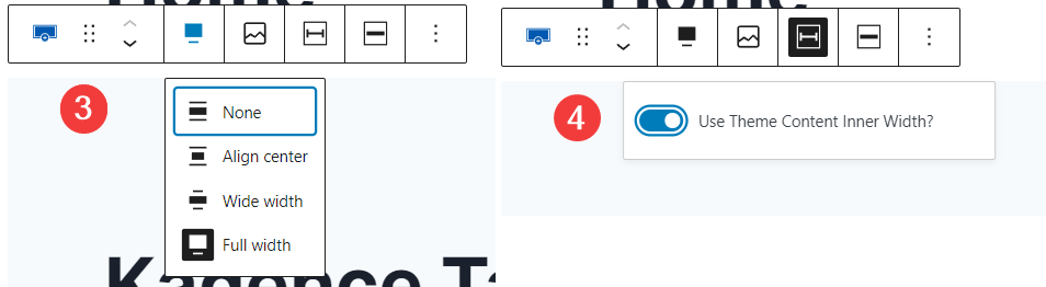
In the first section, we can illustrate the points that are not fulfilled by the customizer alone. Let’s add the missing settings through the widget settings.
- Add a margin of 1rem (16px) to the header
- Add a margin of 3rem (48 px) to the paragraph
- Change section width to full width
- Change the internal content width to “inherit from theme”
Let’s try to compare the result and make adjustments if necessary. The section below with the slider
Not pixel perfect. Try inspecting the home page, what’s wrong?
Hero Section
Row and Section
Row is a nice and handy way to do everything except one. You cannot set the width of the inner section if it is part of the Row. What does this mean?
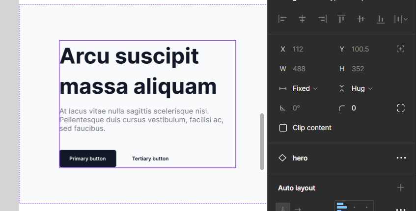
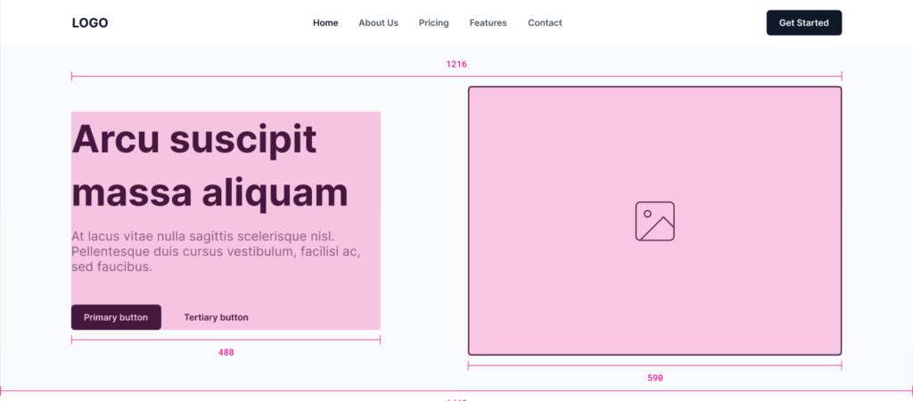
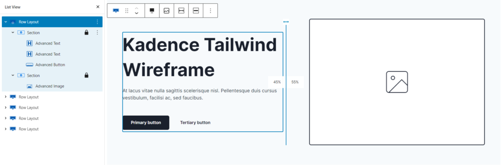
See, in Figma the left and right columns are fixed at 488px-left and 590px-right (equal to the width of the image, right?) When we get the relative width in kadence blocks by dividing the row by the percentage, then the width of the text elements will fill the entire space, in other words the width is not fixed, in fact section has no setting to fix this width, but the individual section element does.
Here is our HERO section structure
How do I set the width of the text elements?
I will give you some ways to control the width of the inner section:
- Change the column width (for row-section) in the 45% picture
- Add padding to left or right side of column (for row-section)
- Add another row and set max-width (row->section->row)
- Add another section and set max-width (row->section->section)
Change the column width
This method affects only one part, in our case the left one. We get the result we need but the right column will move after the slider and the picture will not be in the center like on the wireframe. You can easily fix this by aligning the image to the right. To do this, change Inner Block Direction to horizontal and the alignment will work.
This method is limited in use if we need to adjust the width of two columns at once. In addition, there is a problem with the transition to the mobile version, because the indentation between columns in the mobile version is the indentation between mobile sections.
Add padding
This method is relatively good, from Figma we see that the padding between columns is 112px, we can safely set the padding on the right side of the first column to 7rem, adjust the padding for tablet and mobile. We also need to set the gutter for the row, which can only be chosen from a preset of 0px 20px or 30px.
Again we are not solving the problem for all media queries with one action.
Add another row
This is an obvious solution that will get the results we need, but it generates a lot of code for one small problem. It is enough to insert a column row and set the max-width of the inserted row.
Add another section
I like this solution, we can use the nested section add max-width and solve the problem, but we still can’t control the column width and indent between columns. Or can we? Let’s try to figure out the next section where there is a repeating nested picture-text section – feature card.
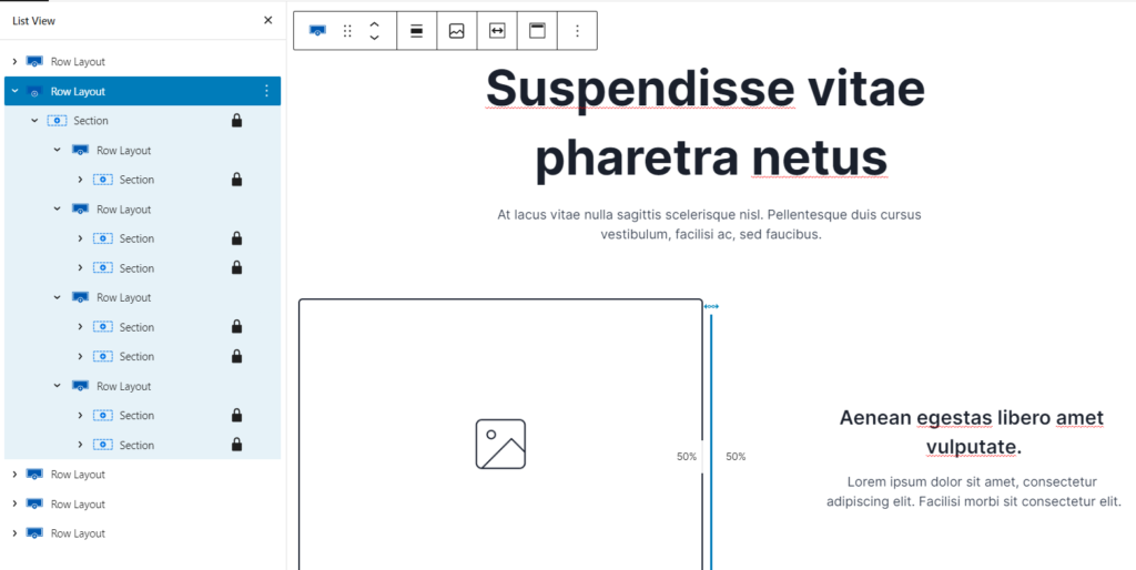
Feature card section
Row->Row
I’m sure you use this method most often. We often use several nested rows. So we assemble the layout in the usual way. I will put one more row inside this one to set the max-width for the text part. Then for each feature card I will also set a row.
This solution is used on the main page to look at and inspect.
Note that the html code for the whole section is the longest
37 lines, 5888 characters

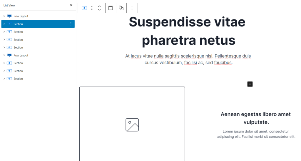
Section->Section
You know the section block now works as a flexbox. This gives us the advantage of using space-between and gap, which applies to both the distance between columns in the Desktop and the distance in the mobile version. Since we use space-between, the gap is just the indent for the mobile version. So with one setting we solve absolutely all problems.
New information for you is the use of a section without rows.
Plus: the shortest code possible.
Minus: You can’t set the background
This configuration is significantly less in the number of characters of the generated html code compared to the previous one: only 4122 characters, which is 30% less. Go here to inspect the version without the row
25 lines, 4122 characters

If you need to add a background, you can’t do without a row.
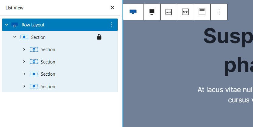
Row-Section-Section
The last option is the best to use one row to add background you can look here and inspect.
A universal combination of the first and second ways.
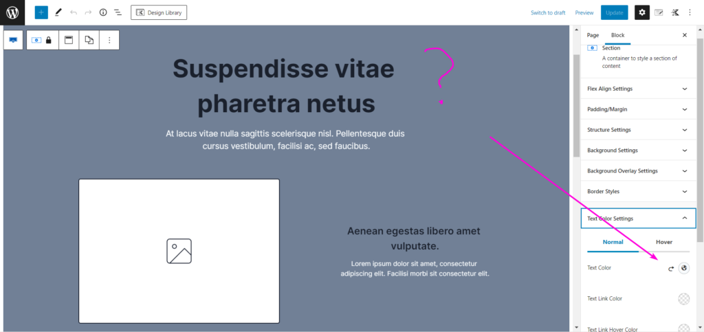
A handy feature if all the feature cards in one section then you can change the color of all the text elements with one click, but the preview refuses to display the color of the headers correctly, although at the front of everything is correct.
4644 characters
Conclusion
Kadence Theme allows you to control most of the parameters in a convenient manner from the customizer. Tailwind styled layouts require you to control the margin/padding values, and more specifically require you to keep them a multiple of 8. This is easily done for 16px fonts and rem indents.
Secondly, you need to control the width of the column and fix it without generating a lot of unnecessary code.
The most optimal way in terms of code and layout convenience is double nesting section->section, this method limits the use of common background, but through the gap and space-between allows you to control the indentation lightning fast.
This is awesome thank you
Thanks Chris! I look forward to your feedback after testing. We have plans to make a ready-made template aka tailwind what do you think what theme to choose?
Thanks for you purchase, appreciate it!